
If you’ve just received a psychological or educational assessment report, you may be looking at a page full of numbers, labels, and unfamiliar terms, and feeling more confused than informed. That’s completely normal. These reports are written to be precise, not to be easy to read, and almost no one walks in already knowing what a “standard score of 85” or a “63rd percentile” actually means.
This guide explains the core ideas behind almost every assessment score, no matter which test was used. Once these basics click into place, the specific numbers in your report become far less intimidating. You don’t need a background in statistics. You just need a clear explanation, which is exactly what this is.
What Standardized Testing Actually Measures
A standardized assessment measures how a person performs on specific tasks compared to a large group of other people the same age. That comparison group is the key idea. When a test was created, it was given to thousands of people across different ages, and their results became the benchmark, often called the “norm.” Your scores describe where you (or your child) land relative to that benchmark.
This is worth sitting with, because it changes how you read every number that follows. A score is not a measure of effort, worth, or potential. It is a snapshot of how someone performed on particular tasks, on a particular day, compared to peers of the same age. It is useful information, but it is one piece of a much larger picture that also includes history, observation, context, and the judgment of the professional who did the assessment.
The Bell Curve: Where Most Scores Come From
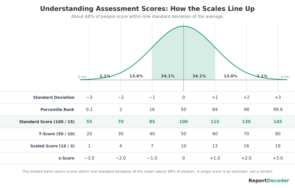
Most assessment scores are built on something called the normal distribution, better known as the bell curve. The idea is simpler than the name suggests.
If you measure almost any human trait across a large population, most people cluster in the middle, with fewer and fewer people as you move toward the high and low extremes. Picture height: most adults are somewhere near average, a smaller number are notably tall or short, and very few are extremely tall or extremely short. Graph that and you get a symmetrical hill, high in the middle, sloping down on both sides. That’s the bell curve.
Assessment scores work the same way. Most people score near the middle, and scores spread out symmetrically from there. This matters because it means the “average” zone is wide and crowded. A large share of perfectly typical people score in that broad middle band, which is exactly where most scores are expected to fall. Essentially, this is where we ‘expect’ people to score at their age.
Standard Scores: The 100 Scale
The most common way scores are reported is as a standard score. On the scale used by many major assessments, the average is set at 100. So a standard score of 100 means performance right at the average for that age group.
The scores spread out around that average in a predictable way. On this common scale, most people, roughly two out of three (68%), score between 85 and 115. That band is considered the average range. Scores a bit above or below it are still close to typical, while scores farther out in either direction are less common.
The single most important thing to understand here is that the average range is a range, not a single number. A score of 92 and a score of 108 are both squarely average, even though one is below 100 and one is above. People often see a number under 100 and assume it signals a problem. Usually it doesn’t. It simply reflects normal variation, the same way being slightly shorter than average height is not a medical concern.
Scaled Scores: The 10 Scale
Not every score in your report uses the 100 scale. The individual subtests, the smaller building blocks that combine to form the bigger scores, are usually reported as scaled scores, where the average is set at 10 instead of 100. A scaled score of 10 means performance right at the average for that age, exactly like a standard score of 100. The two are simply different rulers for measuring the same kind of thing.
Scaled scores spread out around their average of 10 in the same predictable way standard scores do. Most people, again roughly two out of three, score between 7 and 13, and that band is the average range. So a subtest scaled score of 8 or 9 is squarely average, even though the smaller number can look worrying sitting next to a standard score in the 90s or 100s. They are on different scales, so they are not meant to be read side by side as if they matched.
It helps to keep a rough anchor in mind: a scaled score of 10 lines up with a standard score of 100, and both sit at the 50th percentile, the center of the bell curve. In fact, whenever you meet an unfamiliar score, the most useful first question is what its average is. Many scores center on 100, subtests center on 10, and some scales used in other kinds of testing center on different numbers again. Once you know where the average sits, you can tell at a glance whether a score is near it, above it, or below it.
Percentiles: The Most Misunderstood Number
Percentiles cause more confusion than anything else in an assessment report, so this section is worth reading slowly.
A percentile tells you what percentage of the comparison group scored at or below a given score. If a score is at the 70th percentile, it means that person performed as well as or better than 70 percent of peers their age. It does not mean they got 70 percent of the questions right.
This is the crucial distinction: a percentile is not a percentage, and it is not a grade. A child who scores at the 40th percentile did not “get 40 percent.” They performed in the typical range, better than about 40 percent of peers and below about 60 percent. That is normal, average performance, even though “40” might look low to an eye trained on school grading, where 40 percent would be a failing mark.
Because percentiles are tied to the bell curve, they bunch up in the middle. Moving from the 45th to the 55th percentile is a small step in actual performance, because so many people are packed into the center. But moving from the 5th to the 15th percentile, or from the 85th to the 95th, represents a larger real-world difference, because the population thins out toward the edges.
In this way, understanding the Classification Label (discussed below) can also be helpful for our general understanding, since percentile ranks have a large range all within the ‘Average’ umbrella, none of which would be a reason for concern.
Score Ranges and Classification Labels
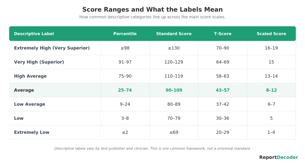
To make scores easier to talk about, most reports group them into descriptive categories, with labels such as “below average,” “average,” “above average,” and so on. The exact wording varies between tests, but the purpose is the same: to translate a number into a general band of performance.
These labels are helpful shorthand, but treat them gently. A label is a category, not a verdict, and the boundaries between categories are not hard walls. A score sitting right at the edge of two categories could reasonably be described either way. The label tells you the general neighborhood a score falls in, not a fixed, permanent fact about a person. Two children with the same label can still have meaningfully different profiles once you look at the full report.
You may notice that the broad middle of the bell curve covers more than just the category labeled “Average.” That is intentional. In everyday practice, the “Low Average,” “Average,” and “High Average” categories together describe the wide band of typical performance where most people fall, and the narrower “Average” label simply marks the center of that band. So a score described as Low Average or High Average is still well within the normal, expected range, not a sign that something is wrong. The labels add detail to the middle of the curve; they do not carve it into “good” and “bad.”
Confidence Intervals: Why a Score Is an Estimate
You may notice that scores in your report come with a range attached, something like “98, with a 95% confidence interval of 92 to 104.” That range is the confidence interval (CI), and it reflects an honest truth about testing: no single score is perfectly exact.
Every measurement has a little wobble in it. If the same person took a similar test again next week, their score would likely land somewhere close but not identical. The confidence interval is the test’s way of saying, “the true ability is very likely somewhere in this band, and this single number is our best estimate within it.” So a reported score is better understood as the center of a small range than as a precise, fixed point. This is also why small differences between scores, a few points here or there, usually aren’t meaningful. They fall within the normal wobble of measurement.
It’s also why a score near an important cutoff shouldn’t be read too strictly. A 128, for instance, may have a confidence interval that reaches 130, the common gifted-program cutoff, so the true ability could plausibly be at or above the line. That doesn’t guarantee qualification, but it means the gap is too small to treat as final, and a good evaluator will weigh that uncertainty rather than treat the cutoff as exact.
What Scores Do and Don’t Tell You
It’s easy, especially when you’re worried, to read a report as a final judgment. It isn’t. Here is what scores genuinely offer, and what they don’t.
Scores can highlight areas of relative strength and difficulty, help identify when extra support might be useful, track change over time, and give professionals a shared language for describing performance. They are a valuable starting point for understanding and for getting the right help.
Scores cannot capture a person’s character, creativity, kindness, resilience, or future. They don’t measure how hard someone tried, and they aren’t an absolute ceiling on what someone can achieve. A number in a report is a description of performance on specific tasks, gathered to help, not a label that defines who someone is. The professional who wrote your report combined these numbers with everything else they observed, and the most meaningful insights usually live in their interpretation, not in any single figure.
Reading Your Report With Calmer Eyes
With these basics in hand, you can return to your own report and read it differently. A standard score near 100 is average. A percentile is a comparison to peers, not a grade. The average range is wide, and most scores are supposed to fall inside it. Labels are neighborhoods, not life sentences. And every score is an estimate sitting inside a small range, not a precise verdict.
Understanding the language is the first step toward understanding what the report is actually telling you, and toward feeling prepared rather than overwhelmed when you discuss it with a teacher, doctor, or specialist.
Common Questions
What is a standard score?
A standard score shows how a person performed compared to others the same age, on a scale where 100 is exactly average. Most people (68%) score between 85 and 115, which is all considered the average range.
Is a standard score below 100 bad?
Not at all. The average range is wide, and a large share of typical people score a bit below 100. A score of 92 and a score of 108 are both squarely average. A number under 100 usually just reflects normal variation, not a problem.
What is a scaled score?
A scaled score measures performance on a smaller part of a test, on a scale where 10 is exactly average. It works just like a standard score, only on a different scale: a scaled score of 10 matches a standard score of 100, and most people score between 7 and 13. A subtest score in the single digits is often still squarely average.
What is the difference between a percentile and a percentage?
A percentile tells you what portion of peers scored at or below a given score, not how many questions were answered correctly. A score at the 40th percentile means the person did as well as or better than 40 percent of peers, which is normal, average performance, not a “40 percent” grade.
What does a confidence interval mean on a score report?
It’s the small range around a score that reflects the natural margin of error in testing. It signals that the score is a close estimate, not an exact, fixed number, which is why small differences between scores usually aren’t meaningful.
This guide covers the concepts shared across nearly all assessments. If you want plain-language explanations tailored to your specific report, including what particular subtests and score ranges mean on instruments like the WISC-V, WIAT-4, and BASC-3, along with diagnosis explanations and question guides for school meetings and appointments, the ReportDecoder library walks through them in the same clear, reassuring way. It’s there whenever you’re ready to go deeper.
Keep Exploring
- The tests behind the scores: assessment tests
- Reading a score: understanding assessment scores
- If a diagnosis is in the picture: understanding a diagnosis
- Your next steps: what’s next
- Browse every guide: the full guide directory